In an omnichannel world, every piece of branded content needs to be informative and conversion orientated. Amazon Storefronts are becoming increasingly important because they help bridge the gap between your unique brand story and browsing shoppers. Are you doing everything to stand apart from the competition?
Business Insider recently ranked Bobsled as one of the top Amazon firms, and we’re directly responsible for hundreds of successful Brand Stores. In today’s blog post, Bobsled’s Lauren Sutehall has shared her most pertinent insider knowledge in relation to Storefronts.
Read on for tips, common mistakes and examples of stellar Brand Stores that are generating millions in revenue on Amazon today!

What is an Amazon Brand Store?
Amazon Brand Stores are customizable pages where brands showcase their catalog of products on the Amazon marketplace. Also known as Storefronts, Brand Stores are only available to businesses that have been approved for Brand Registry.
Brands select a template and upload files with the ‘Store Builder’ tool. The idea is to give browsing shoppers an overview of everything you have to offer in one place, similar to your own ecommerce website.
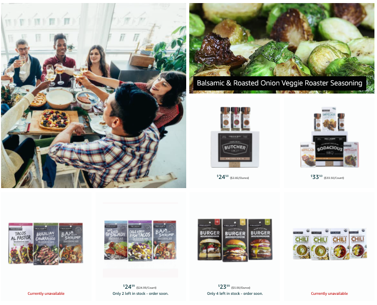
Above: Example of Amazon Brand Store content.
Tips for making a spectacular Amazon Storefront
- Lead with colorful images and a brief brand story, especially if you sell 'boutique' or unique types of products
- Try to utilize the background video option – it will automatically capture the viewer's attention and doesn't require a click
- Limit the amount of text – the average Amazon shopper is a lazy reader. Icons or text overlay on images can be way more effective than a dense paragraph.
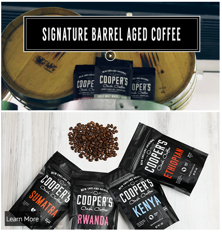
Above: Ideally your Brand Store should be a combination of videos and images.
Image Credit: Cooper's Cask brand store on Amazon.com
Things to avoid when creating an Amazon Storefront
 Don't forget to add lifestyle imagery! Just relying on your product assortment can result in a bland Storefront
- Try to create a Storefront that parallels your brand's ecommerce website. This will help with consistency, and alert returning customers that they are in the right place.
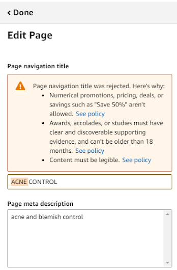
- Content compliance can be tricky. Amazon will reject your proposed Storefront if it contains numerical promos, illegible information, or references to awards or accolades that can’t be verified, to name a few. Amazon is often inconsistent in terms of what they allow vs deny, so don’t be surprised if you need to spend time tweaking files, even if you read the content policy thoroughly ahead of time.
Above: Example of an Amazon Brand Store upload error message
Examples of great Amazon Storefronts
Cooper's Cask. Good color assortment and clever integration of influencer lifestyle images into their Storefront. Note: if you intend to use images that belong to third parties, always be sure to get their approval.
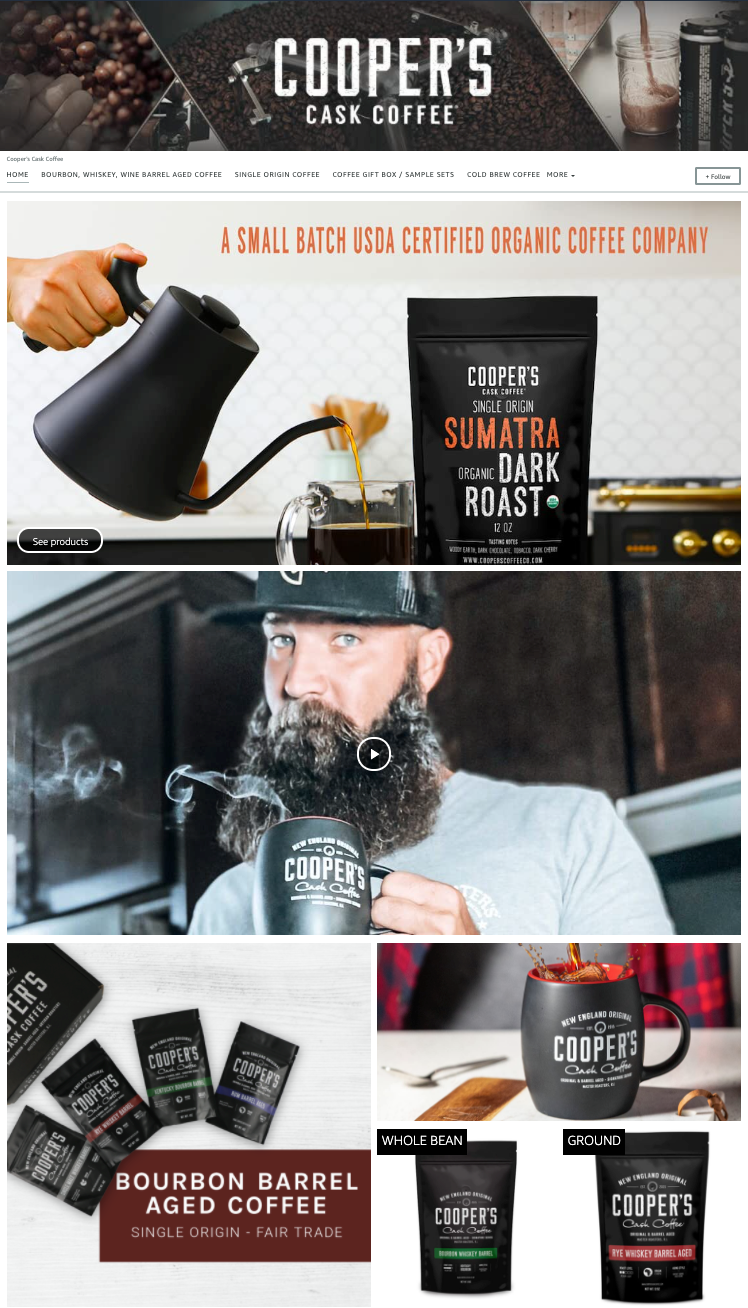
Image Credit: Cooper's Cask brand store on Amazon.com
Check out How to Use an Amazon Storefront to Make
Your Brand More Money
Yo Mama's. Layout is clear, easy to navigate, and their food imagery is fantastic! Incorporates videos seamlessly.
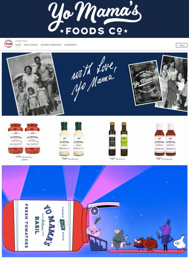
Image Credit: Yo Mama's brand store on Amazon.com
Urban Accents. The individual images with text overlay is a nice touch, helps drives shoppers directly to product pages.
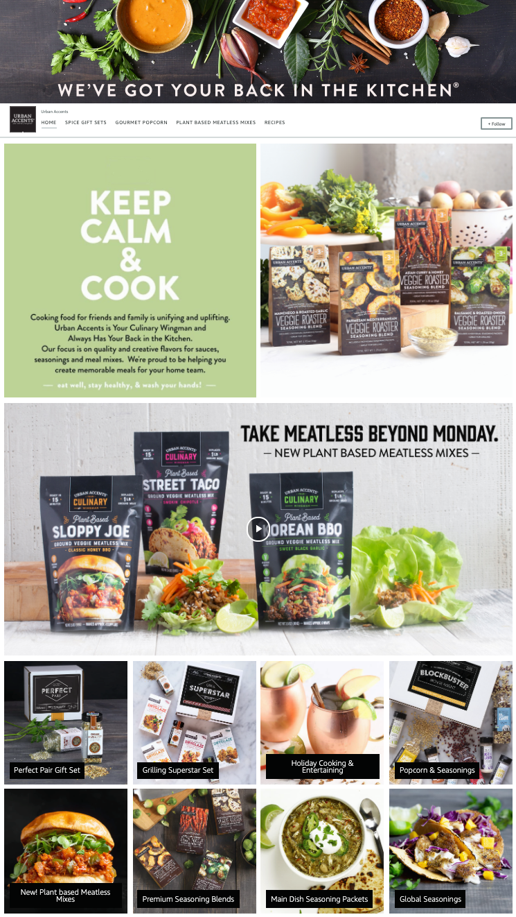
Image Credit: Urban Accents brand store on Amazon.com
REN. The uniform color palette by product line is super smart. Good mix of lifestyle vs. product shots. Plus some interesting nav bar roll ups by usage type/collection, and the usage of shoppable images works great.

Image Credit: REN brand store on Amazon.com
NEED HELP WITH YOUR AMAZON BRAND STORE?
The Bobsled team would love to support your efforts!
For a free consultation, click the button.
{{cta('0825dfed-dfd0-4c96-bfc0-9b14009fed23','justifycenter')}}
